YouTube Devlog, UI, units energy level, orbital view

In the last days I've worked a little bit more on the video devlog for YouTube (I got an Idea that I'd really like to use), but I need better hardware to do decent stuff. So it's on hold for now.
Yet, I really don't like the idea of let time pass by... I might release it, even if the quality won't be as I'd like it to be.
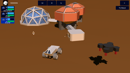
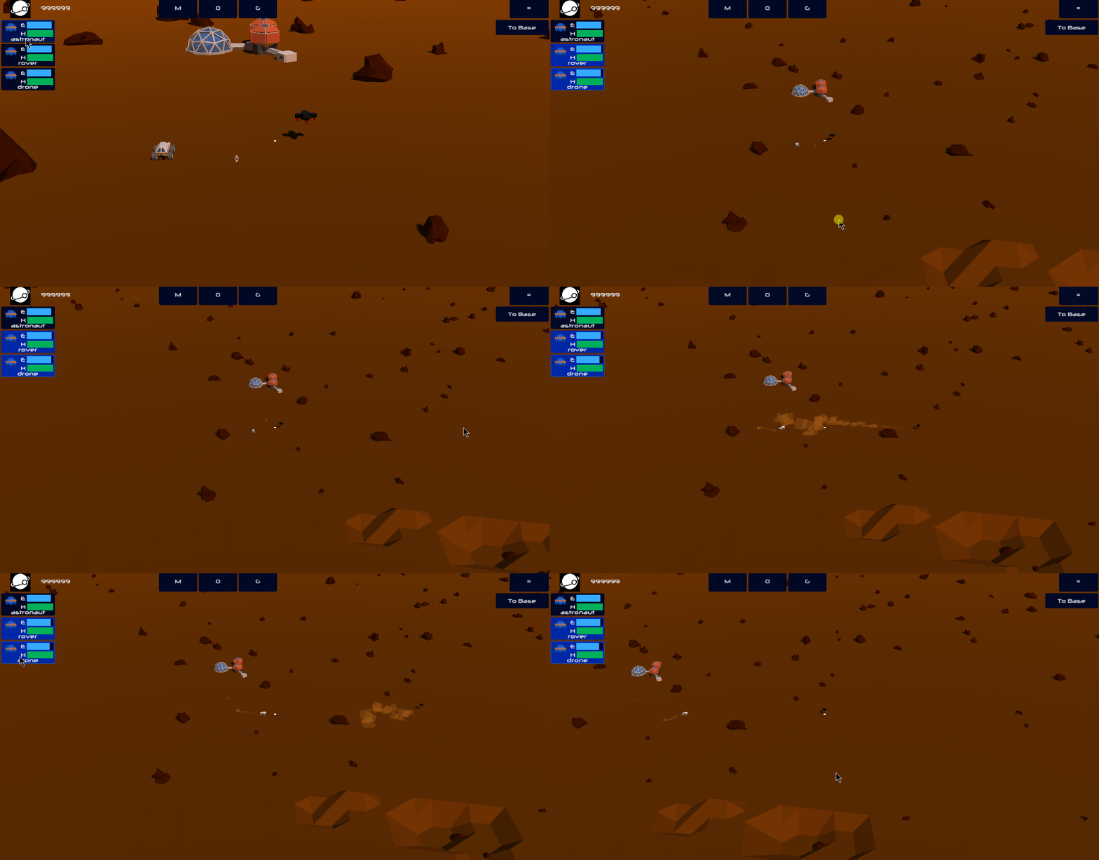
About gamedev process, I am cleaning up code and adding the UI elements I need in order to control the units. You can see it below, you have unit's energy and health levels. Logic that controls energy level is already implemented, the more you move, the more energy you consume.
I'm not sure about how the health level should work, it might be like: it slowly consumes as time pass by, but also the more you use your unit.

Also you can move to the unit by double-clicking the unit "dashboard". There I'll add a contextual menu that will allow to see more stuff, current action, precise stats, and more.
I've also encountered weird bugs, such as too bright lights compared to the previous engine version, game crashing if I get back to the main menu too fast. For the first one I've opened an issue https://github.com/godotengine/godot/issues/34257 that apparently for now went under the radar, no feedback from other devs. That's fine, I can live with brighter colors for now.
The navigation module developed by dodafish will probably not receive further improvements, so I'm not sure if I should adopt it. Anyhow, I'm sorry about it, because it looked like a great improvement to the current navmesh system Godot has right now.
Another thing I'm working on is the global view, or orbital view, where you'll be able to have a glance at all your bases, go to any location, deploy your landing capable components (cargo, and crew), and more. For now you can just rotate, move to a location is not 100% working.
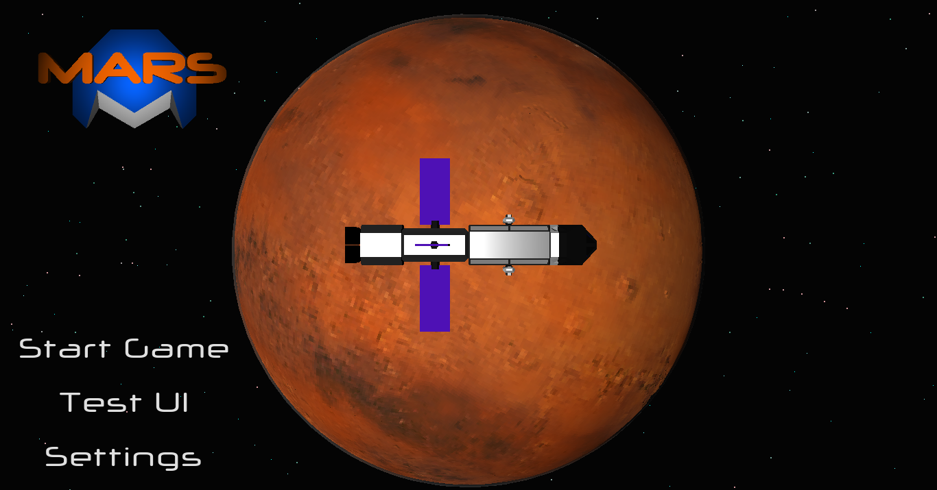
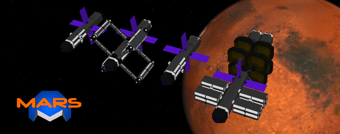
Oh yeah, one last thing I have worked on is also the homescreen, apart from alternating the ships I have built, it have a different logo, or a should say a different illumination and angle, I think it looks better.

Mars
A mobile low-poly 3D game where you colonize mars.
More posts
- Windows and Weather - It's been way too longAug 01, 2020
- Gamestate and World simulation in Godot (part 4) - connecting dotsJan 29, 2020
- Gamestate and World simulation in Godot (part 3) - Getting deeperJan 17, 2020
- Gamestate and World simulation (part 2) - Data driven model?Jan 06, 2020
- Homescreen transition, gamestate and world simulation (part 1)Dec 30, 2019
- Orbital view - 3D label or not 3D label, that is the questionDec 23, 2019
- Units AI and proofreadingDec 09, 2019
- It's ALIVE!!⚡️⚡️Dec 06, 2019

Leave a comment
Log in with itch.io to leave a comment.